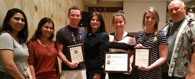
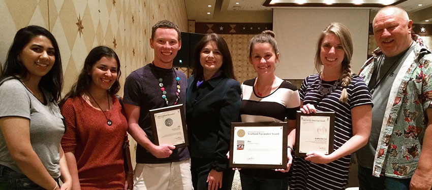
University of Miami Student Publications Garner Top Awards from The Associate Collegiate Press
Austin, Texas, a city known for keeping it hip, welcomed the nation’s leading college media outlets to the annual ACP/CMA National College Media Convention in November. University of Miami’s yearbook, Ibis, magazine, Distraction, and newspaper, The Miami Hurricane, received awards at this year’s convention. The 2014 Ibis yearbook won a Pinnacle College Media Award for College Yearbook of the Year for 2015 from the College Media Association (CMA) and their ninth Pacemaker from the Associated Collegiate Press (ACP). “UM is very lucky to have a dedicated Ibis yearbook staff that [...]


