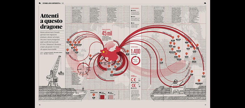
What are the rules of data visualization, a practice that draws on research into cognitive theory, graphical perception, statistics and journalism? The journalist and educator Alberto Cairo helps tie together many fields of study into easy-to-follow guides to data visualization and information graphics.
In the past decade, computer-aided data visualization has migrated from the halls of science and academia into journalism, marketing, political discourse, and many other parts of everyday life. A lively conversation has developed online about data visualization, with blogs and social media accounts devoted to critiquing them. But what are the rules of a complex practice that draws on research into cognitive theory, graphical perception, statistics and journalism?
With his 2012 book The Functional Art, the journalist and educator Alberto Cairo helped tie together many strands into a compelling and easy-to-follow guide to data visualization and information graphics. Cairo, the Knight Chair in Visual Communication at the University of Miami School of Communication and a longtime veteran of news information graphics in Brazil and Spain, is finishing a follow-up book that will be published by Peachpit next spring. I talked to him about his forthcoming book and his thoughts about the evolving art of information visualization.
Through your journalism work, teaching, workshops and books – and now Massively Open Online Courses, you’ve done as much as anyone I can think of to popularize data visualization and infographics. Why do you think your message has drawn so much interest? You have had thousands of students in your online classes, for example.
Alberto Cairo: Today you have confluence of factors. The first is that more people are buying the idea that words alone are not powerful enough to communicate effectively, that you also need visuals. The second factor is that the tools of the trade are becoming cheaper, and in some cases they are free and easier to use than ever. I am amazed that I can code a complex data visualization in R, for example, with just three lines of code. My favorite tool at the moment is Quadrigram – it does a lot of what Tableau can do, and it’s free. It’s web-based, and it lets you download the code you have generated with it. Imagine that tool 15 years ago, it would be thousands of dollars. So tools like CartoDB, Quadrigram, Tableau Public, all these tools are enabling more and more people to jump in and start doing visualization.
The third factor is the popularization of visualization, through the popularization of the principles behind creating effective and truthful data visualizations. You have a new batch of books written in a style that is friendlier, much less technical, and much more accessible for the general public. They are easier to read and less technical without being shallower.
Please visit http://news.nationalgeographic.com/2015/10/151016-data-points-alberto-cairo-interview/ to continue reading this article.


