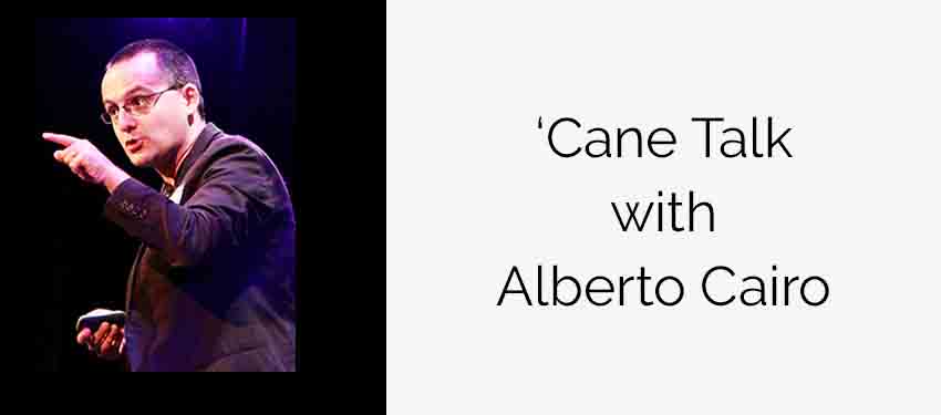
Never before has so much data been available to the public. From crime statistics to public school test scores, citizens have the ability to access mountains of data on issues that impact their lives locally and globally. But having information isn’t the same as being informed. How can citizens use data to identify trends or pinpoint new solutions? In the past two decades, visualization—the graphical display of information— has become a skill as important as literacy or numeracy, as it is arguably the most powerful tool to help us derive meaning from the enormous amounts of data produced daily. Until recently the tools of data visualization were available only to scientists, statisticians, and designers. But now, thanks to easier and cheaper tools, data visualization is becoming a language available to everyone. Watch international data visualization expert Professor Alberto Cairo during his ‘Cane Talks to see these tools at work and how you can apply them.
Alberto Cairo is the Knight Chair in Visual Journalism at the School of Communication at the University of Miami and also directs the Visualization Program at UM’s Center for Computational Science. He teaches courses on information graphics and visualization, and is interested in the convergence between visual communication, journalism, cognitive science, maps, and statistics. He is the author of several books about information visualization including The Functional Art: An Introduction to Information Graphics and Visualization (2012) and The Truthful Art: Data, Charts, and Maps for Communication (2016). He organized the world’s first journalism Massive Open Online Course (MOOC) and has spoken at the most influential international conferences on visual journalism and design. He has taught and consulted for educational institutions and media companies in more than 20 countries. He was previously the director for Infographics and Multimedia at Editora Globo, the magazine division of the biggest media group in Brazil, and an assistant professor at the School of Journalism at the University of North Carolina at Chapel Hill. He also led the creation of the award-winning Interactive Infographics Department at El Mundo in Spain.


